When you need the best product photos on Instagram, check out the below-mentioned steps. As you follow better rules and procedures, your image will be best looking. In addition, optimized photos will get higher shares and engagement as well.
1. Go for Flat Lay
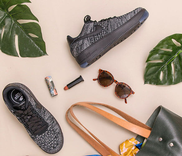
In simpler words, flat lay is way popular on Instagram. When you want to maximize the potential of your product image, go for Flat Lay. Most Instagram users are used to the style and vibe on the flat lay. You get to attract these viewers and get higher engagement.
Setting up flat lay photography is not much of a deal. For instance, create a plain setup, place the product on the surface and start taking photos from the top direction. We know it might seem a bit intimidating, but with time it will come to you. It would be better if you check out our Flat Photography guide for in-depth info.
2. Have a Lighter Background

Pastel colors are becoming trendy nowadays as a product background. Even when you scroll through Instagram feeds, most of them probably include a lighter background. For the exact reason, choose a light-coloured cloth or sheet as the background.
Having a light color as a backdrop makes the whole composition warm and welcoming. Plus, it blends nicely into the Instagram interface. As we have seen, lighter coloured backgrounds such as off-white convert more than one eCommerce product page; you should follow it out.
3. Manage Proper Lighting
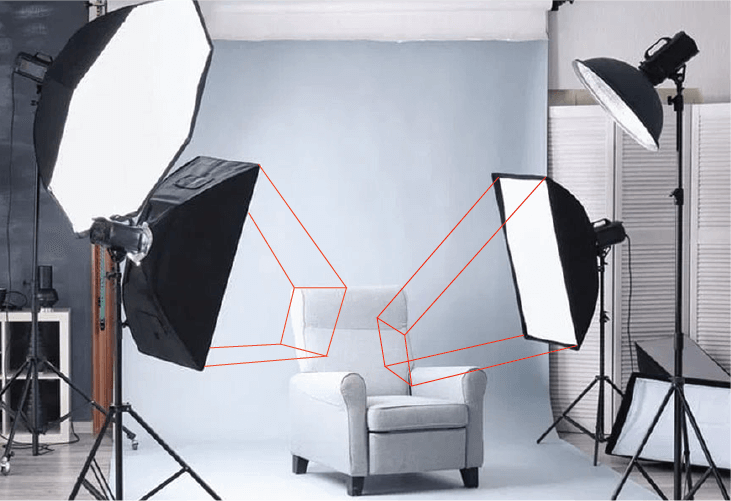
The overall lighting setup can either make or break your product photography. First of all, try to utilize natural lighting. It will do other things if you do photography besides a window. But as we know, it’s not always sunny outside. In such instances, use artificial lights like softbox and umbrella lighting.
Don’t worry about having expensive lighting gears, as you could use any cheap LED lights as well. The key is to diffuse your lighting and make a softer shadow. Use a soft cloth in front of light if it’s cast a harder shadow. Do the same to the windows if the sun is brighter than usual.
4. Photography Grids
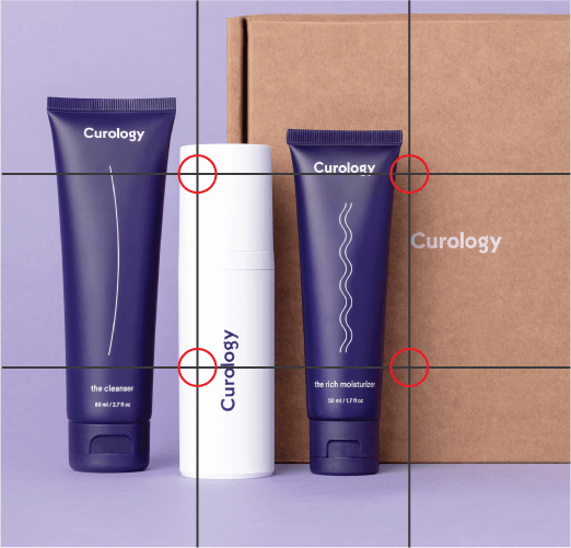
Remember the old-age 3×3 vintage photography grid? We are mentioning it right now. In other words, it’s called the rule of thirds. You could turn on the grids on both your smartphone and DSLR camera. Once you turn it on, the lines will be visible on your camera lens.
The main idea is to align your product to the appearing grid lines. It helps your photo to have balance and appears attractive to viewers. Either you could place your product at the center or place it at any of the intersections of the grid lines. In both ways, image composition attracts more eyeballs to the Instagram post.
5. Check Out The Styles
Before you stick to a specific product photography style on your Instagram page, check out the trend beforehand. When you find out the perfect style fit, make sure to stick to it for a while. In addition, don’t hop in between different styles. Maintaining a consistent style will help you create brand awareness for your page visitors.
Maintaining a certain style will help you get started with your setup. As you don’t need to adjust the setup, the process takes less time. Hence, it’s the best option to keep working on a specific photography style that suits your product.
6. Be Aware of Props
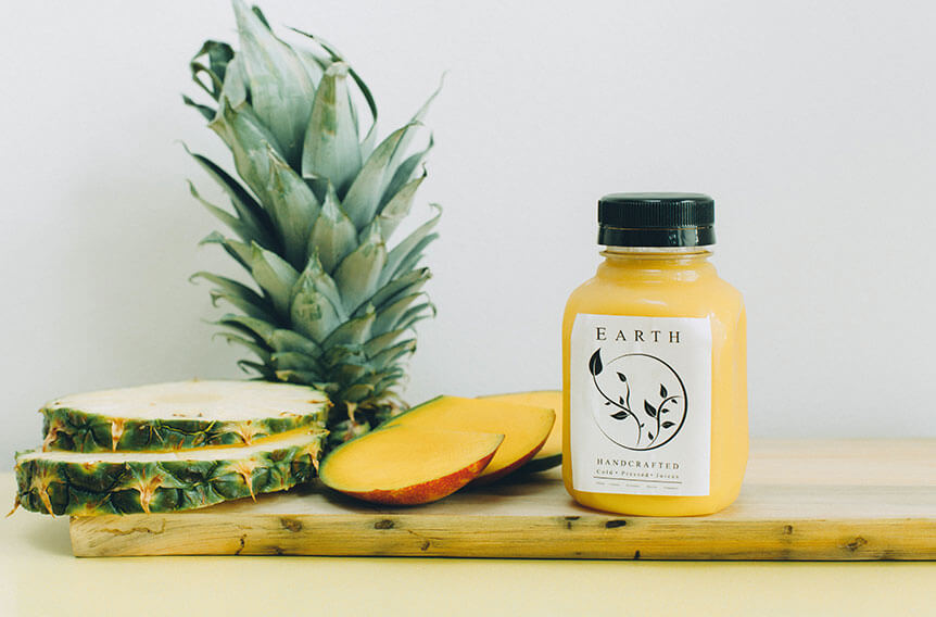
When you are adding props to the image and experimenting with product photography ideas, be minimalistic. Most people often clutter their product image composition with unnecessary, which is why choose the perfect props which compliment your product. For example, you could use props to place your product onto.
In addition, the product should be in focus and main attraction. Don’t let the props distract the viewers from your product. Minimal props increase the diversity of your images yet provide full focus on your product.
No Comments